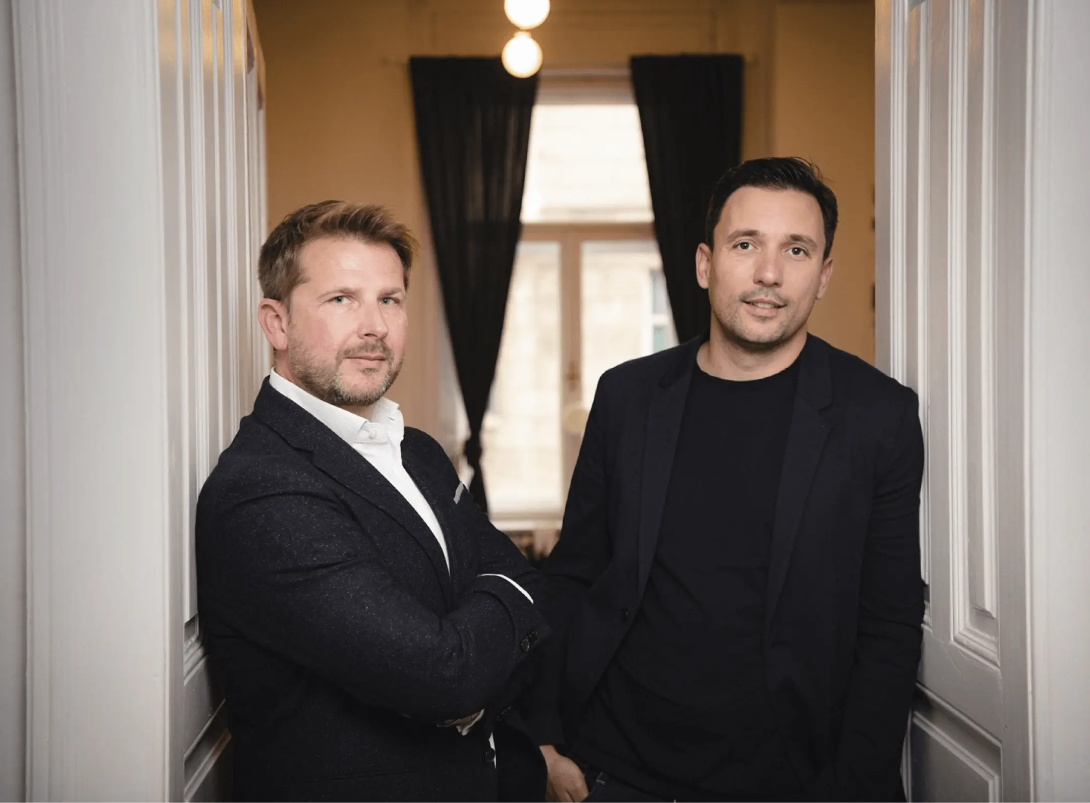
How to Freshen Your Brand Identity, Without Actually Ruining a Logo of Your Company

Lovro MiokovićProduct Updates
6 min read

As someone who doesn’t have any background in tourism, I knew very little about tourism and all the advantages Rentlio offers to its customers. But knowing proper tools was the key to elevate the existing Rentlio visual identity to another level. 

I feel that every designer will always say the same thing – the process of the redesign is long and sometimes hard. Take any brand that changed its identity lately – such as popular communication tool – Slack. Even such a “small” change was complicated, and it took months of adaptations, testing, and making the wrong and right steps.

Slack logo redesign

My redesign job was even more complicated because I wanted to meet the expectations of a project I admired personally for a long time before I joined the Rentlio team. Pressure? You bet. 

The redesign included a lot of small tasks that I needed to complete: 

  • the visual needed to be timeless (Coca Cola, Kodak)
  • typography needed to be readable and clean, but not too strong 
  • the sign and typography need to accurately describe brand separately and in a group
  • visibility of the visual needs to be simple and clear in any size and any situation 

The biggest challenge was to tell the story through a redesign. I would usually work on a project, get paid for it, and that was it. Afterward, I would lose contact with the people and the project I worked on. In Rentlio, you live your job continuously. Every project – so this one too. There will always be some new tweaks and changes to better as I develop further professionally. Stakes are now much higher, as well as the responsibility. The biggest challenge and pleasure was to define the visual framework of a brand that will continue the tradition and tell the story that brand promotes from the very beginning, but at the same time, make it clear to anyone in any situation while aligned with the design industry norms. As a product used in more than 40 countries around the world, we needed to transcend language and create a solution that would be recognized everywhere. 

I knew Rentlio was more than just another company before I joined the team only by listening to plenty of satisfied clients and team members explaining their workplaces to someone – their small story within a big one. I confirmed this to myself just after I spent a couple of days in the Rentlio office.

How to visualize startup energy, the whole team, and an entrepreneurial project?

Rentlio, for me, presents strength, innovation, technology, quality, openness, speed, simplicity, the sea, and colorful hoodies. Of course, it’s necessary to follow industry guidelines such as: 

  • The color palette: pre-defined colors with a new twist by adding new tones into the gradient
  • The right amount of spacing 
  • The weight of each element must match the next element such as in an example below


All of it doesn’t matter if you don’t convey the feeling behind the company – because then you become generic and empty – exactly what Rentlio isn’t, and we don’t want our visual identity to present. 

How to present a brand in one small visual?

For this to be possible, I needed to start from different atypical angles of the redesign process. In the majority of redesign cases, I would work as someone from the outside – an agency designer who worked for a client. This time I was inside – a part of the story. It’s hard to define that point of view, and I can describe it only as my impression. In the end, the redesign was a way to present my personal experience as a new team member to everyone who meets with Rentlio for the first time.

Flawless transition = modernization

Throughout the whole identity, the recognizable color palette dominates – tweaked just enough there are none of the tones skipped. The smooth, flawless transition that stresses modularity, modernization, and simplicity.

color palette

The redesign process starts with a conversation

Before I started working on a redesign, we surveyed within Rentlio team members. We got answers to questions such as “What does Rentlio mean for you?” and “What associations do you tie to Rentlio?” The results show that the primary associations I should pay attention to are: openness, transparency, guest focus, modernity, transparency, technological advancement, devoted to details, global, playful,…


Associations of a user, keyhole and the globe = Rentlio 

We divided crucial parts of an existing sign and emphasized and styled them additionally. For redesign to be successful, it needs to communicate primary Rentlio associations (a user, keyhole, and a globe). By combining all three, the logo works and delivers them in a subtle, pleasant, and visually attractive way.

 Furtherly, we tweaked and visually styled all of the details. The goal was to get a styled sign with a “soft” silhouette without losing the building blocks of an existing logo.

We also adapted spacing within the sign and used different patterns, colors, and transitions to stress its modularity while communicating primary associations such as playfulness or openness.

Clean typography

New typography is “softer”, less direct, and it is a logical addition to the Rentlio sign that makes a clear whole. Primarily, we did that by not using caps lock at all.

With all the small corrections in typography, Rentlio’s logotype moved away from the standard letter. By smoothing and making key points rounder, we pointed to logotype simplicity and playfulness.

How to redesign without visual standards of a brand?

The old logotype created an excellent ecosystem and recognisability. It translated its colors to illustrations, visuals, social media posts, and details throughout Rentlio – from websites to hoodies. All mentioned, a bit subconscious too, made brand guidelines that will be a pillar for any future visual change we make in the future. The foundation is set, but identity modularity will change. There will be new elements as we grow, but the basis, both narrative and visual, is set.

Ready to get started?

Create an account and get your team on board. You'll be amazed at what you can do with Rentlio.

  • Free 10-day trial
  • Easy setup
  • Cancel any time, no contracts
  • No credit card required

Lovro is Rentlio’s product designer, who’s all about creativity and 3D digital design. He’s a real audiophile who occasionally loves to escape to nature on his bike. Not to forget, he is a proud dad of a five-year-old Andrija.